Simone Stringuini Clinic
Industry: HealthThe Simone Stringhini brand represents the commitment to provide healing through dermatology, efficient aesthetic results, restoring the patient’s radiance and self-esteem. Witnessing the transformation in people’s lives and their happiness after the procedure is what fuels the brand’s passion for what it does.
Deliveries:
Positioning
Strategy
Visual Identity
Solution
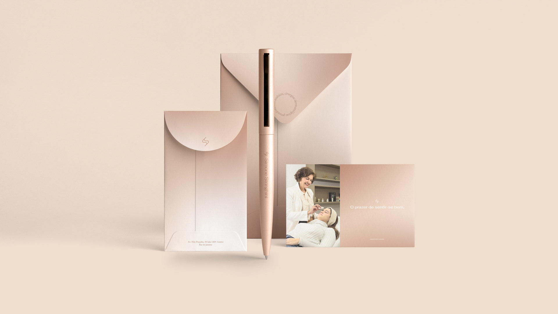
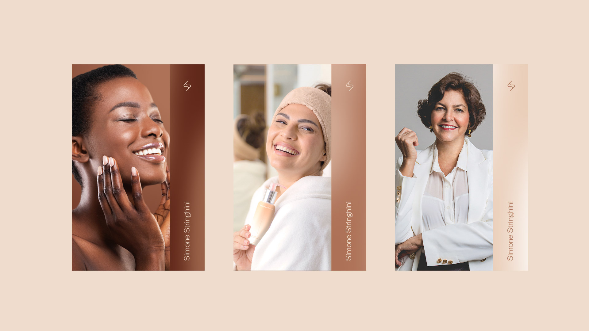
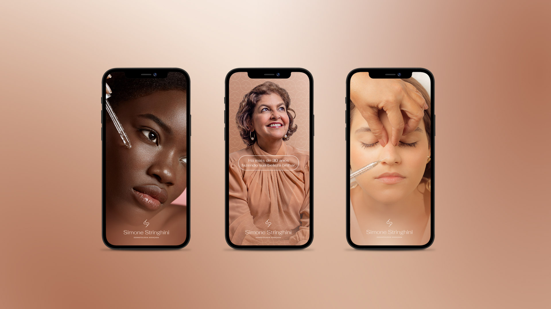
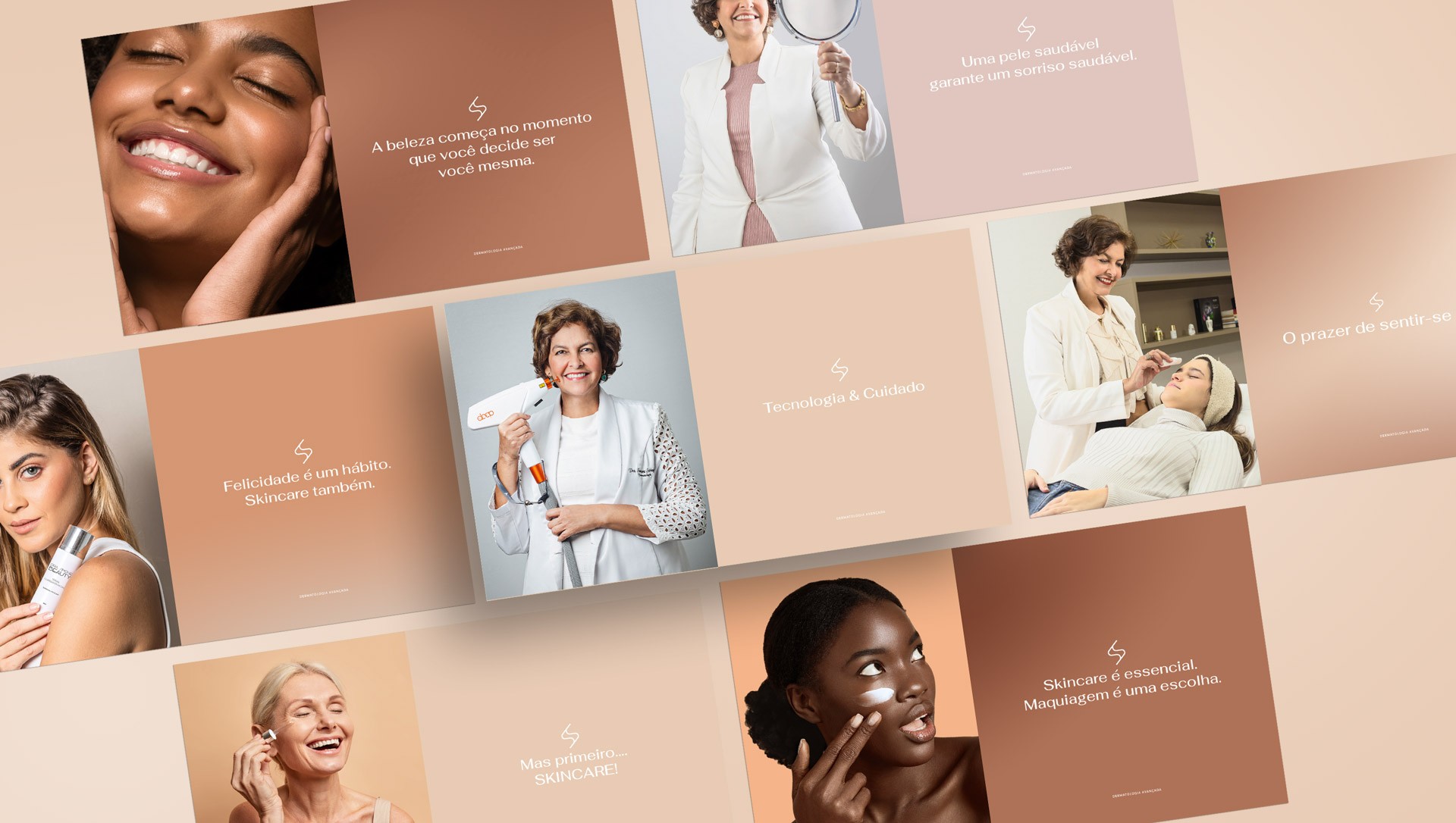
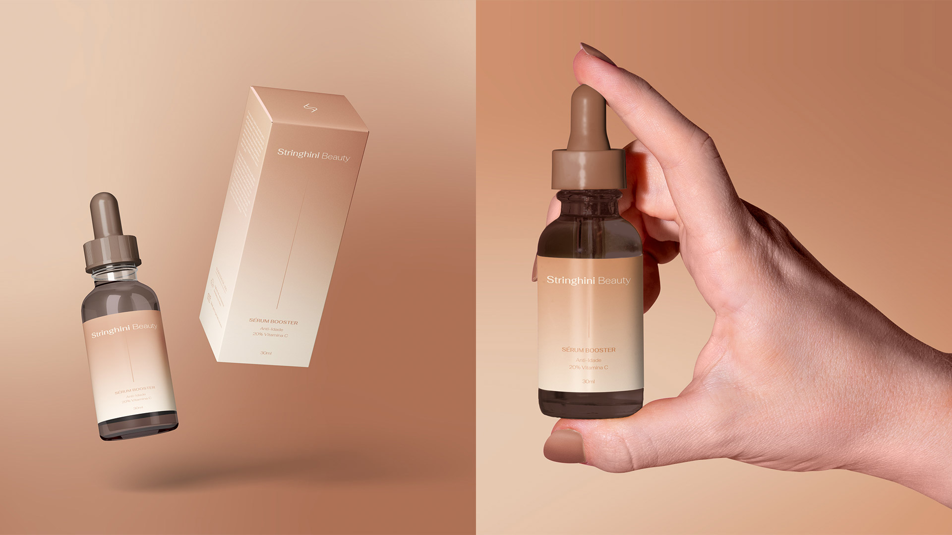
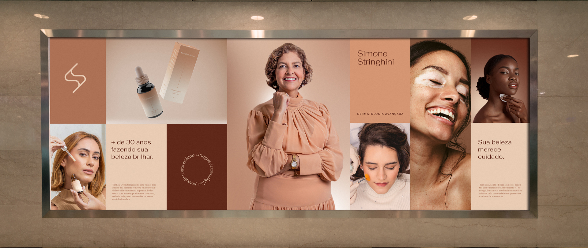
The colors were carefully selected to showcase the diversity of skin tones.
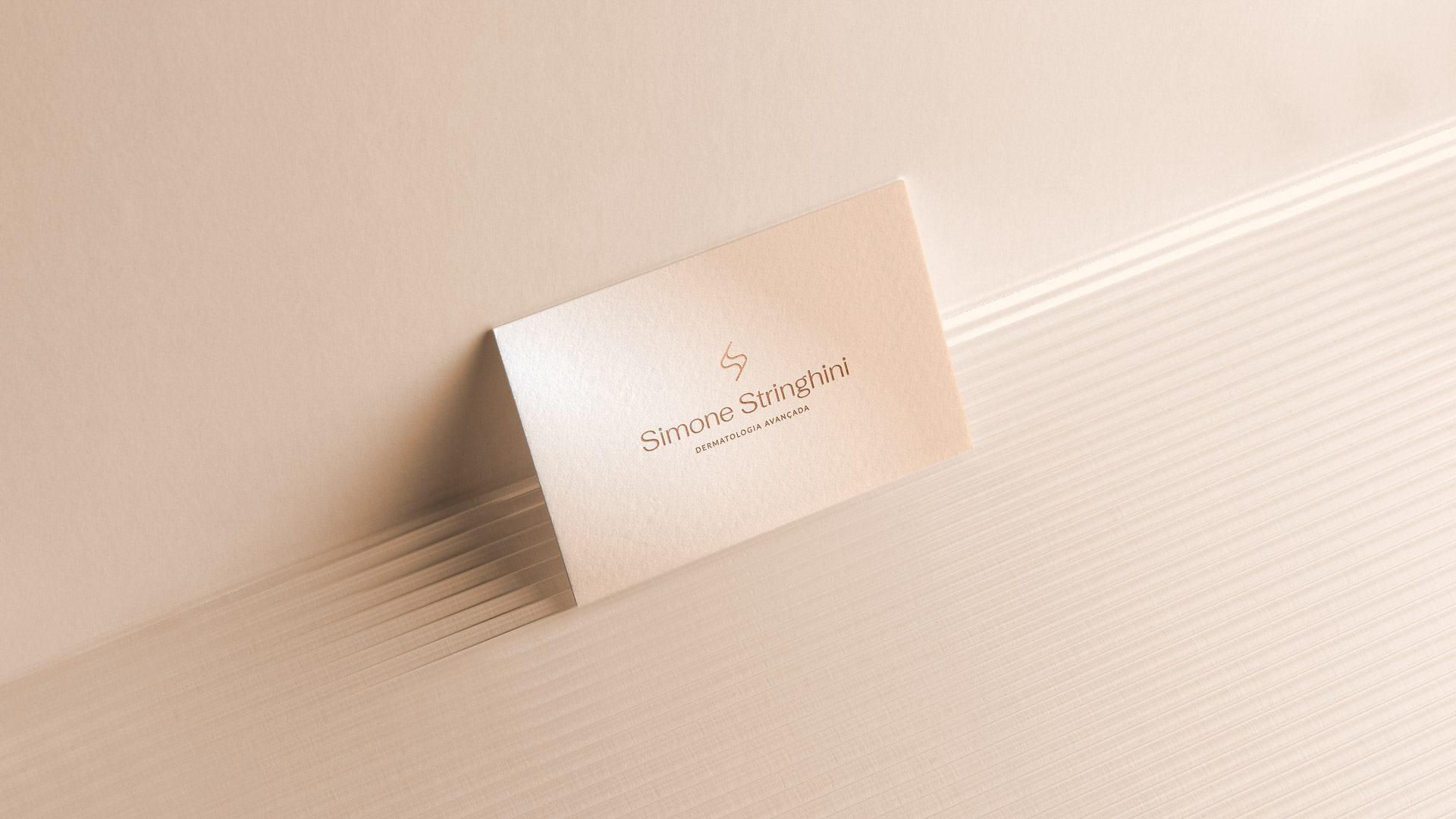
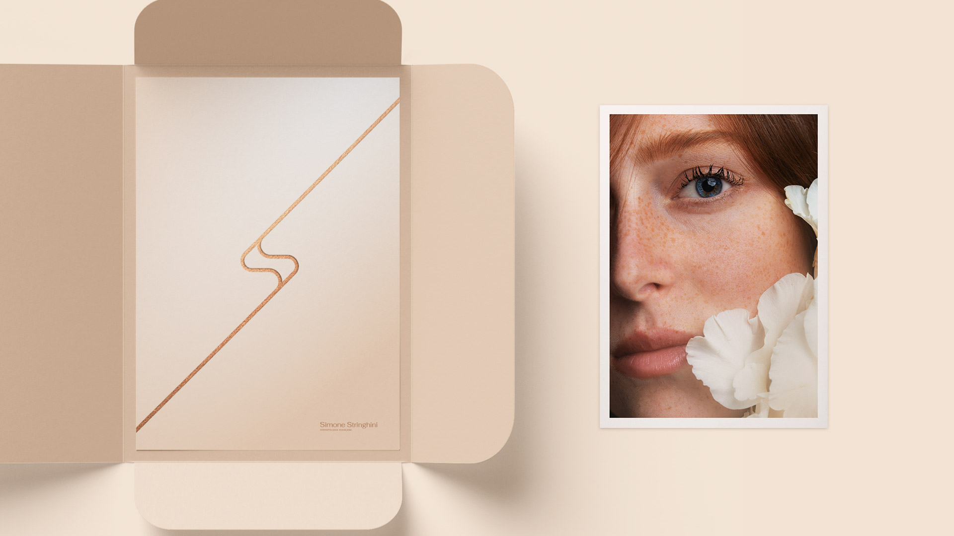
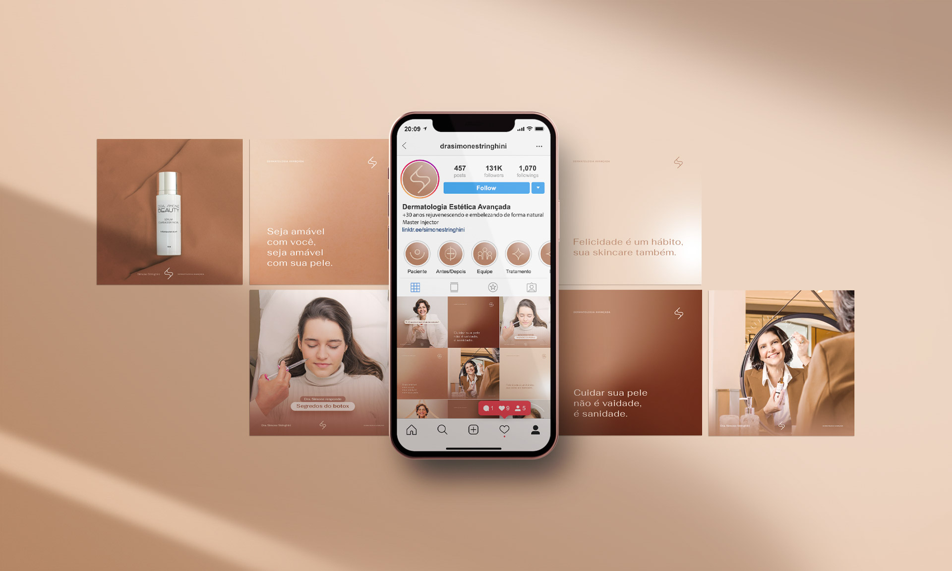
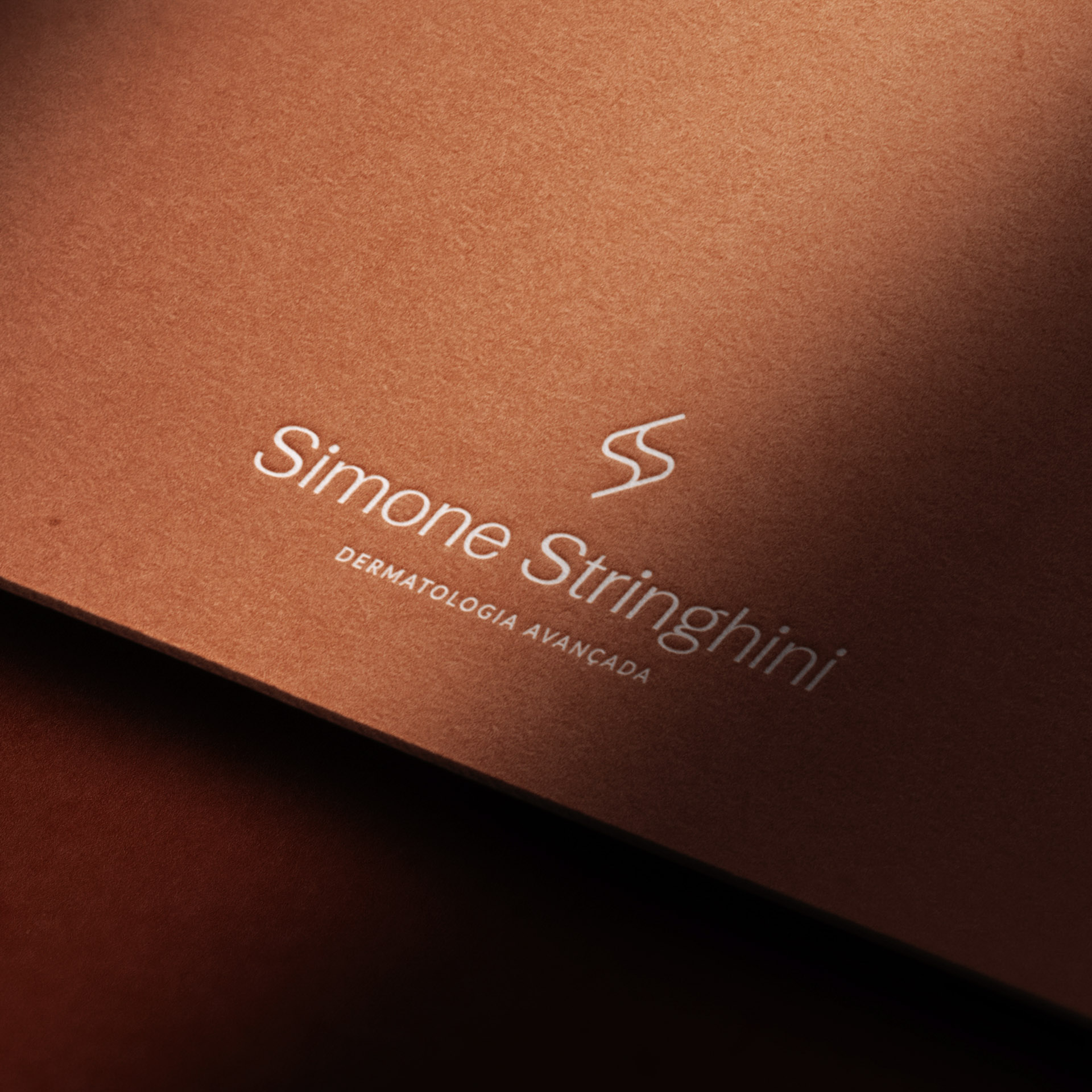
The symbol underwent an update from its previous version. By combining the initials “S” from the first and last names, a unique, timeless, and elegant monogram was created.
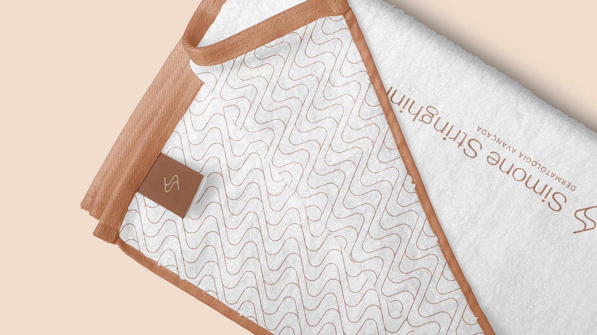
All these elements, together with the visual identity, establish a diverse, professional, and welcoming universe for the patients.


Central Idea
The colors were chosen to represent diversity.


